Looking for someone to help strategize with your team on what UX / UI work should be done for maximum impact?
How a Unique Approach to Strategy Improved the Customer Experience
Iterative strategy and data-based UX and UI for key conversion pages that we worked with the team to carefully monitor and adjust.
What we accomplished
-
24%
Increase in Click-Thru Rates
-
10%
Increase in # of Visitors Finding Info Sought
-
40%
Decrease in Bounce Rate
Founded in 1968, TransUnion has evolved to become more than a credit reporting agency; they aim to be a sophisticated, global risk information provider. With a focus on providing the most complete and multidimensional information available, TransUnion strives to advance the industry by facilitating commerce to increase the standard of living for consumers and businesses around the world.
THE OPPORTUNITY
In the ever-evolving, intricate world of credit reporting, TransUnion recognized that a lack of complete and multidimensional information for their customers was confusing the loan process and overburdening their call centers.
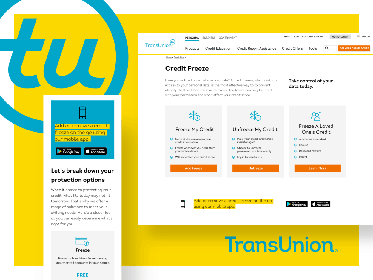
To supply their customers with better site experience and more thorough answers to their questions, the company set out to redesign the UX for their contact page and offer a more concise site experience from a design perspective. This involved rethinking the information hierarchy, reorganizing content, and making better aesthetic choices. The goal was to ease the burden on their call center by offering easier access to information and being more deliberate with their FAQ and call options.
“It all comes down to helping [TransUnion’s] customers find answers to the questions they have, whether it’s about their credit or about placing a credit freeze or any of the products they offer. Their customers need to be able to go online and easily find this information.” Ian Palmer, an LLT Group senior designer who worked on the project, said.

Client Type
Industry Leader
Employees
7,100
Headquarters
Chicago, IL
Solutions
Strategy, Experience
Services
Workshops, User Experience, User Interface Design, Web Design

THE APPROACH
Since the goal of the project was to improve the customer experience while reducing call volume and page bounces, LLT Group needed to implement a strategy that allowed them to work seamlessly with multiple decision-makers and influencers at TransUnion. The creative team typically meets with a minimal number of decision-makers, but this instance was unique in that TransUnion was requesting a final product that required feedback from numerous stakeholders across multiple departments. LLT adapted their process by centralizing their communication to a few key players so they could have more substantive discussions about key choices and provide more comprehensive notes to support their strategic recommendations.
“We were able to provide reasoning and explanation as to why we made our choices and discussions that both TransUnion and us can help advocate for,” Melissa Leide, creative director at LLT Group, said. “Instead of us trying to collaborate with 12 people, we only had to collaborate with two, and then they were able to help us present to the larger group.”
This shift in communication strengthened the relationship with TransUnion and added the necessary clarity and context to the recommendations as the information was presented to the rest of the decision-makers.
“It’s a matter of opinion from all the stakeholders so they want to have notes accompanying the [recommendations], so they can sell the idea,” Ian Palmer said. “I’ve taken to writing more comprehensive notes to send over. They really like that, because it enables them to articulate our ideas.”
From their research and meetings, the LLT team decided to break away from their traditional workflow and focus on one specific page at a time. They prioritized the credit freeze and contact pages on the site and focused on the overall design of each page and how information was relayed to their customers. Instead of customers having to call a TransUnion support number, site visitors were able to answer their questions through strategically worded and well-placed FAQs, better page layouts, and more visible Call to Action buttons.
To ensure that this new experience doesn’t negatively impact the rest of the site, LLT continues to optimize both the work they deliver and their conversations with TransUnion. This approach ensures reflection on previous work and maintains a holistic look throughout the site.
THE RESULTS
These pages continue to go through constant evolution, but TransUnion has seen a significant reduction in call volume as more and more visitors continue to positively interact with the site and engage with the new content and page design. With a greater emphasis on rethinking and reorganizing content, they saw a 10% increase in the number of site visitors saying they found the information they were looking for. The decision to frame this updated content around well-placed ‘Call-to-Action’ buttons produced the intended results as the new page design by LLT generated an aggregate increase of 24% for click-through rates as these buttons were the most clicked on elements of the design.
This was further proven by the 40% decrease in bounce rates on the contact page, as well as exit rates improving from 15% to 11%. As they continue to leverage LLT for analytics, insights, and proper page tracking, TransUnion plans to expand this new design across the rest of the website to continually improve upon the customer experience.

