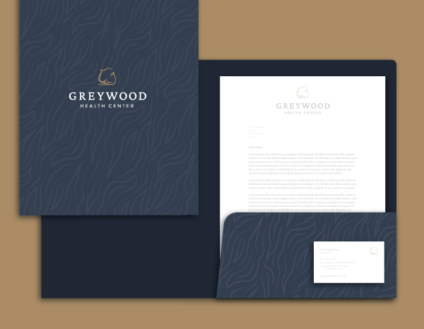
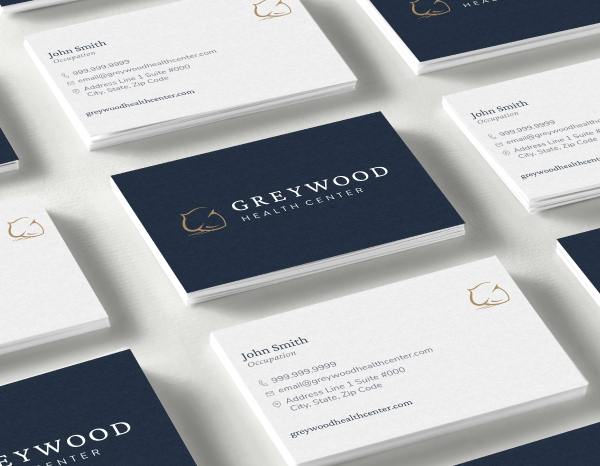
Greywood white logo
  • Branding
  • Graphic
  • Web Design
If you are broken, you do not have to stay broken.

Greywood Health Center is a private mental health center that provides on-site therapy and medication management to adolescents and young adults in the Chicago area. They came to us with a name and a vision and we in turn delivered an established brand, collateral, and web experience that reflected Greywood’s professionalism, kindness, and expertise in the psychotherapeutic industry.

  • Challenge

    Establish Greywood as the leading youth-focused health care center through their empirically-driven approach to psychological well-being.

  • Solution

    Create a serious, yet calming brand and collateral that reflects Greywood’s professionalism and expertise, while also developing a modern, patient-centric web experience that builds trust in patients and their caregivers.

  • Results

    A beautiful brand, calming website and memorable marketing materials that provide information, build trust, and establish Greywood as a leading mental health care center.

Branding

Greywood Health Center was looking for a sophisticated, yet calming brand that reflected their expertise and professionalism. An acorn was chosen for its association with strength and potential, and colors for their warmth and sophistication.

Design & Development

From the homepage all the way through the program pages, Greywood Health Center’s website needed to feel calm and sophisticated while still being informative and approachable. By pairing minimal designs with a soft color palette and custom watercolor illustrations, we created a soothing and reassuring web experience throughout the site.

LLT Group Laptop
Greywood Homepage
Watercolor Bunny
Illustration Base
Watercolor Illustrations

While expertise and professionalism were important to convey to parents and guardians, we also wanted to be sure this same audience understood Greywood’s approachable psychotherapeutic style. We utilized custom illustrations across the site in order to soften the relevant content and draw the user’s eye down the page.

GreywoodIcons
GreywoodOurValues 1
Overlapping Elements

In order to break up the traditional grid, we included overlapping elements throughout the design. Additionally, we added interactive sliders to keep the content minimal and remove clutter. This had the added benefit of providing a fun, modern way to keep users engaged while scrolling.

Greywood Texture Detail
GreywoodTextureBase
Unique Textures

Texture helps add depth and interest to elements that might otherwise feel flat. Using the established wood grain texture from earlier collateral not only helps create interest but also unifies the overall brand experience.

Sophisticated Brand Rooted In Compassion

The result is a calming yet approachable brand with a clean UX that provides users with the necessary information they need to get started today.

Greywood Acorn
Back to Portfolio
312.487.2482
Start a Project
Lets Do This!

Dig our Work?

Lets Do This!