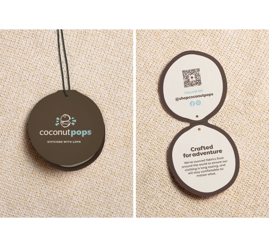
Crafted for adventure
What we did
Branding
Logo Design
Art Direction
Web Design
Web Development
Launched in May 2023
coconutpops.comRegardless if your family is on a crazy hiking adventure, or just at the house doing the daily routine, Coconut Pops understands life is full of twists and turns and the clothing your children wear should work in all scenarios life throws at it.
Coconut Pops is crafting clothing for kids with some of the highest quality materials, creating a durable and yet comfortable end product that all young kids AND parents can enjoy.
The challenge
To create a cohesive brand experience that allows customers to understand the versatility, uniqueness, and benefit of the products lineup offered.
The solution
To create a website that showcases the brand’s personality, while allowing customers to easily learn, explore, and shop for products.

Extending The Brand
The name “Coconut Pops” inspires something visual and auditory; This allows for play between the pictorial and typographic elements in these final logo options. Each option approaches visualizing the coconut in a unique way. The bulk of the exploration went towards assuring the marks were legible, polished, and meaningfully diverse in how they were compose
Ultimately, this final “pop” option was chosen because of how timeless and talkative it felt. The mark itself tells the story, making the logo and brand that much more memorable because of it.
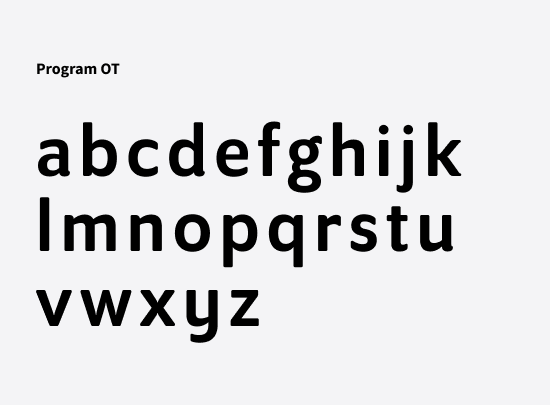
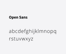
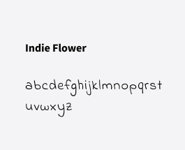
Typography with personality
A down to Earth color palette

Finding a balance between adventure and functionality
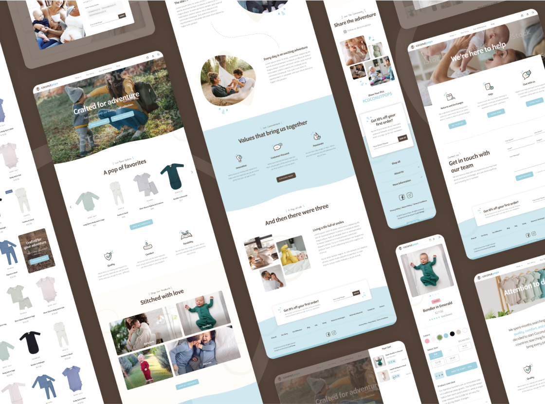
As a brand with a fun and energetic spirit, we wanted to create a website that communicated the adventurous and versatile lifestyle that Coconut offers through its product lineup. The stylistic choices made help customers relate to the brand while keeping the website as a whole fun to explore and easy to navigate.

The Nitty Gritty Details
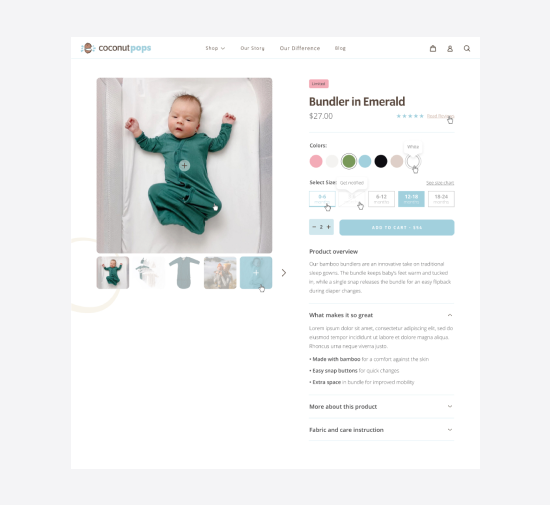
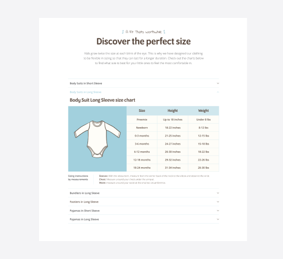
With an eCommerce-focused website, we had to plan for scalability without breaking the visual language across multiple products. We wanted each product page to feel on brand, yet showcase that specific product’s unique features, sizes, and colors. What we designed allows customers to easily access a size chart, see what colors and sizes are in stock, and read all the product details. The add to cart button appears above the fold to maximize the probability of conversion.

Taking the brand further
The final piece of the puzzle is taking all the pieces of the brand, and putting them together to create a true life style brand. This means designing everything from the product tags to the product patterns.

Comfort In Style
The client was looking for something coconut-related on the pattern, and requested cream and brown as the main colors (with blue garment trim) to match their branding, as it was their inaugural product design. They also wanted the garment to be gender-neutral, so we kept the overall design suitable for any baby.