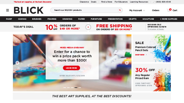
Hero Slider
We created a dynamic grid slider with the ability to place imagery and text in multiple areas. Because the promotions varied so widely, we needed to make sure that the message could always be clearly communicated through.
Blick Art Materials is a 100-year-old company that has prided itself on being a one-stop shop for creatives, boasting 70+ stores nationally and 90,000 products. Taking some of that ‘creative’ spirit we created a new UX / UI for nearly every page of their existing website.
Create new, innovative layouts (leveraging existing brand standards) that helped to drive customers to the one product that they wanted out of 90,000, all while integrating into an existing backend system.
A heavy focus on the real user experience and making sure they are presented with categories and products early and often.
A sleek, new design that simplifies categories and user pathways with pops of color and imagery with a deeply effective search.
Because each of the pages being designed was borrowing from an existing, live layout we made sure to clearly outline and conceptualize ideas before finalizing them into high-fidelity mockups. This allowed for minimal digital design revisions and confirmation that any sections being designed were, in fact, able to be integrated into development.
In order to get each custom designed page into the market the fastest, we followed a page-by-page deployment approach, launching 1-2 pages a month. This required us to have considerable development discussions prior to design and allowed us to create a repeatable schedule with known quality and consistency of design and deployed pages at a maximum.

With over 100 years of history in the marketplace, it was important we enhanced the brand image without straying too far away from its current position. Through research of users and stakeholders, we instilled sound design practices that better address the needs and wants of active Blick Art Materials visitors.


We created a dynamic grid slider with the ability to place imagery and text in multiple areas. Because the promotions varied so widely, we needed to make sure that the message could always be clearly communicated through.


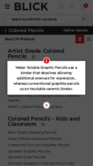
While mobile is important for nearly every UX / UI project we undertake, Blick had a special focus on the mobile user. Coming from a non-responsive website, we made sure that all designs were explicitly mocked up in desktop, tablet, and mobile.

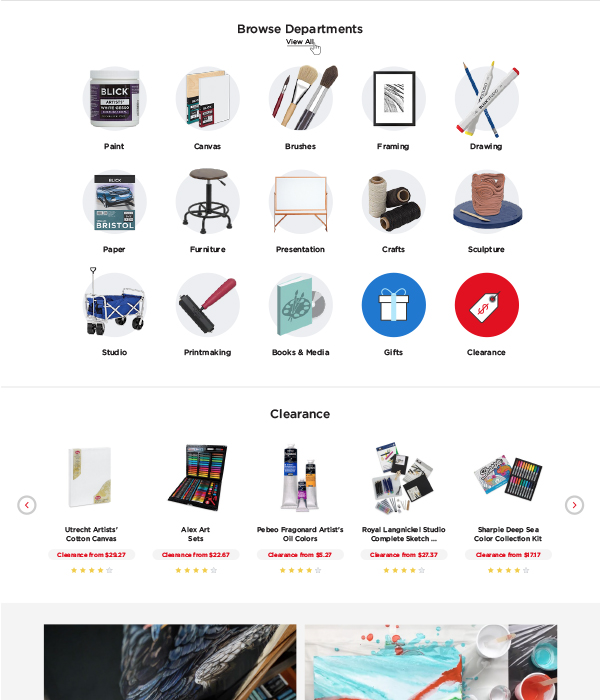
Simplifying and redefining departments (and their respective sub-categories) was a large undertaking just because of the sheer amount of products. Through research, discussions, and discovery we settled on the optimal mix in order to get customers to their end product destination in the least amount of click-through possible.

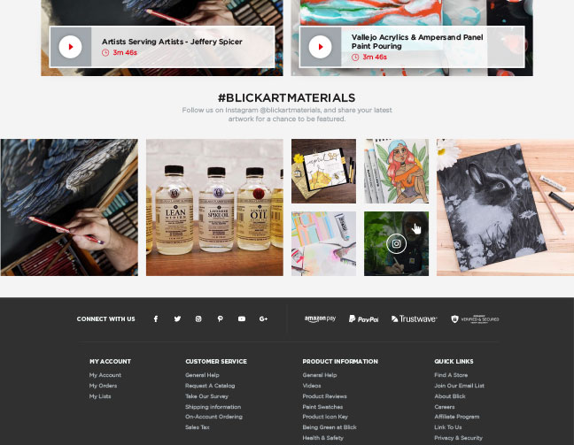
With such a large following of creatives and artists, the Blick Instagram was a goldmine of attractive content posted by users of the products. By making posts that show up able to be included in the feed or not, we were able to provide the ability for Blick to include user content in their website without concern of under-moderation.
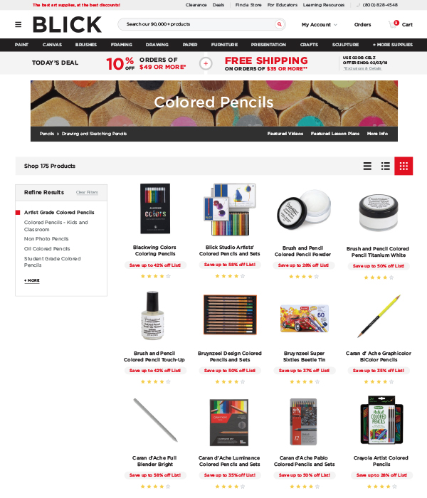
With each category page being slightly unique to the information that was needed to be hosted, we concentrated on making module layouts that could easily be integrated into the backend ERP and then future edited by web and marketing administrators at the company.
The project was a complete success, pairing planning with the design with development in perfect harmony; allowing Blick to better serve it’s thriving creatives.
