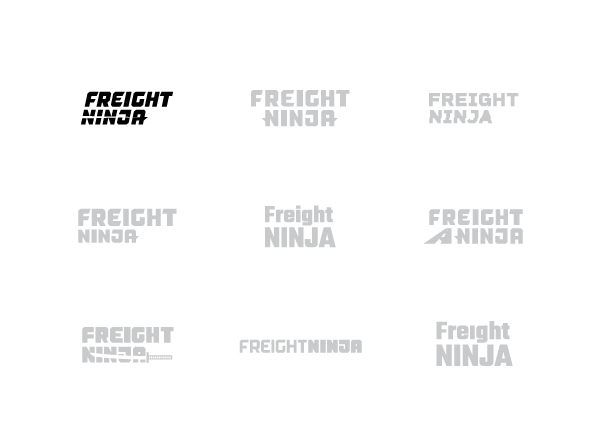
Typography Exploration
When exploring type, we wanted to create something that felt bold and trustworthy with a good sense of personality. The final type tells a nice story, helping to complement the mark and remain memorable on its own.

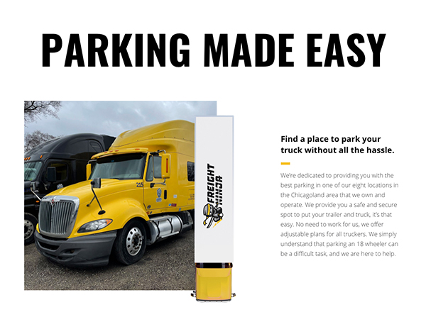
Freight Ninja is an extension of Legend Trucking, a family-owned freight logistics. Freight Ninja is dedicated to providing truckers a fast, safe, and secure location to park their rig at the end of the day.
Freight Ninja wanted a recognizable brand and easy to use website so that truckers could learn about their locations to make parking their truck as easy as possible.
Bold branding and interactive landing page that utilizes parallax motion and interactive elements to draw the customers eye towards valuable information for Truckers
A brand that sneaks up on you with a website that educates customers about who Freight Ninja is and how to book a spot.
The character and personality were a major focus for us when developing the Freight Ninja brand. Everything from the character, pose, and type needed to be pointed in the right direction. Paying homage to the Legend Trucking brand was another consideration that lead to the sharp, fast, and angular approach we took.
To keep the brand feeling bold and modern, we chose high contrasting colors that also connected Freight Ninja to their sister company Legend Trucking. To make sure that the brand scaled for different applications, we created a mark that would work with multiple different applications in a single color, one color, and dual colors.


When exploring type, we wanted to create something that felt bold and trustworthy with a good sense of personality. The final type tells a nice story, helping to complement the mark and remain memorable on its own.
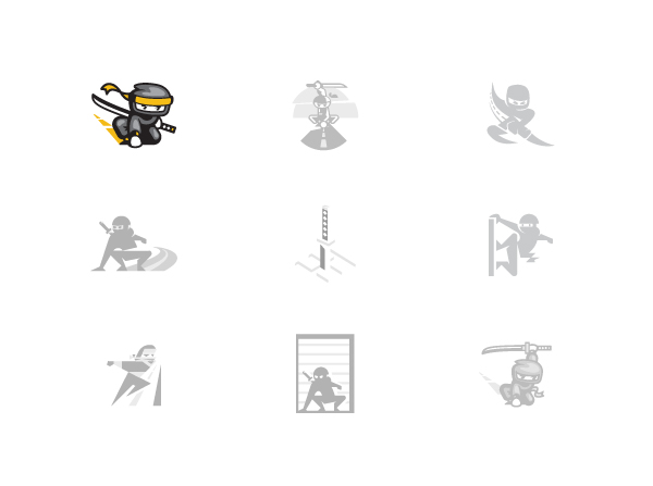
By narrowing the subject matter we explored down to just the ninja itself, we were able to spend more time exploring poses and mark integration. Making iconic poses out of simple shapes was a really unique challenge that yielded a really sharp set of options. The final mark was chosen because of its combination of legibility and personality.
We developed an interactive landing page experience that allows truckers to quickly learn about Freight Ninja, the benefits they offer, and the locations they owned where you can park your truck.
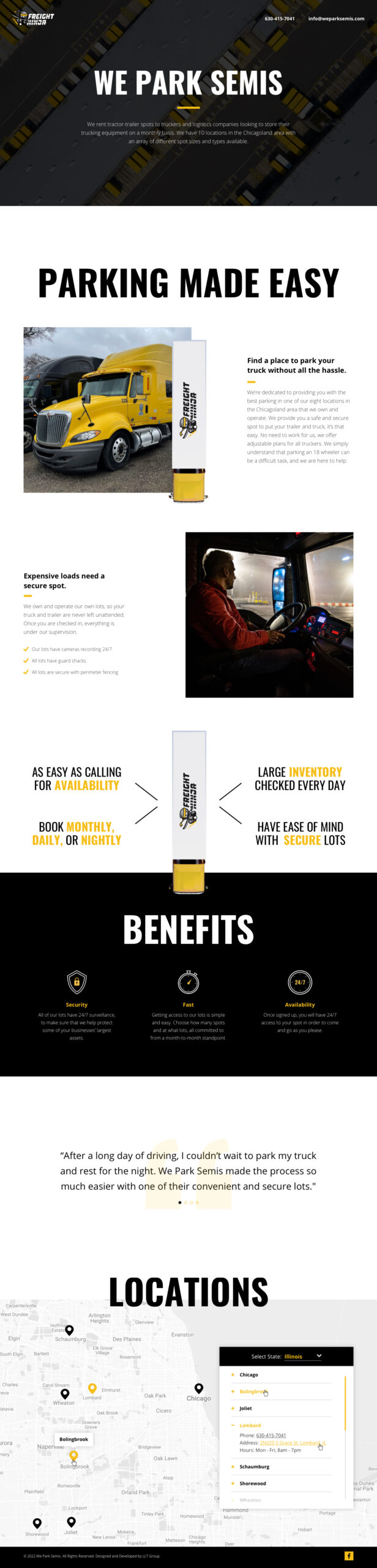
As the user scrolls down the page, a Freight Ninja branded truck joins them for their journey, revealing content along the journey. We designed this section to be fun with the additional movement, but also scalable so sections could be added or removed as Freight Ninja grows.
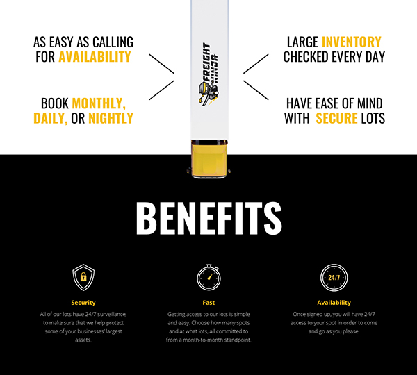
Freight Ninja wanted a bold aesthetic that really stood out. In addition to the high contrasting colors, we strategically utilized large headlines to call out different talking points on the page to make the whole experience digestible. This strategy allows truckers to quickly find the information they are looking for, making the parking process even easier.
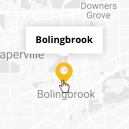
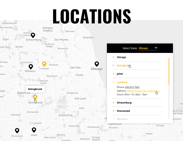
Including locations directly on the front page was something we felt would be important for any truckers looking to book through Freight Ninja. By providing the address and location phone number, we allow truckers to easily book their spot for the duration of their stay.
Just as Freight Ninja brings together the best of technology and logistics, we were able to integrate the best of graphics and web. Iconic illustration sharpens the brand, while dynamic pages and smart interactivity bring the larger brand experience to life.