Helping companies hire the best talent in the world.
Meltzer Hellrung is a legal firm focused on helping employers scale their immigration programs. Their unique mix of having the brightest legal expertise, a service-oriented mindset, and innovative technology give them an edge over competitors in their space.
The challenge
To communicate the firm’s services and value proposition in a new web experience, utilizing a more confident and assertive tone that better stands out to the types of clients Meltzer Hellrung seeks to attract.
The solution
A clean, professional-feeling new website that matches the firm’s recent rebrand and pulls no punches on the firm’s unique qualifications and abilities.

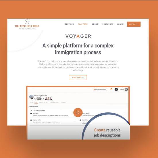
Extending The Brand
Meltzer Hellrung had recently undergone a visual brand refresh, so we set out to uphold the new standards and aesthetic in the website’s design, including custom fonts and an updated mix of colors.
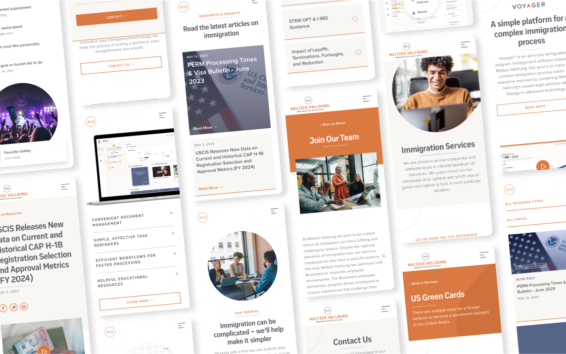
While their brand standards featured a robust selection of secondary tones, we primarily opted for grays and oranges as we colored website elements in an effort to keep things feeling unified, although the Resource Center gave us an opportunity to delve a bit deeper into their palette.
To avoid boxy-feeling layouts, we made many of our image containers round, echoing the shape of the firm’s circular “MH” mark.
Typography
A strong color palette

Keeping it clean and bold
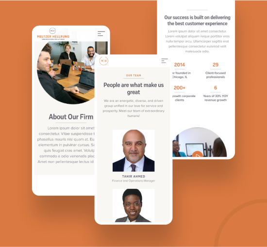
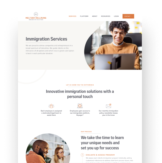
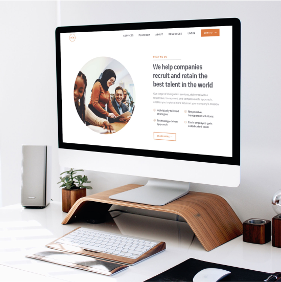
Because Meltzer Hellrung intended to shift their messaging to a more assertive tone, we worked to support that direction in the visual design of the new website. We gave weight to the content by using larger heading sizes, with contrasting eyebrows to add helpful context as well as pops of color.
Relying on primarily white backgrounds helped create an uncluttered effect that focused the user’s attention on the display type and images, as well as fostering a smooth, flowing feel to the layouts.


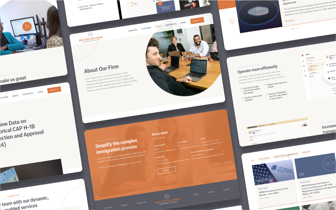
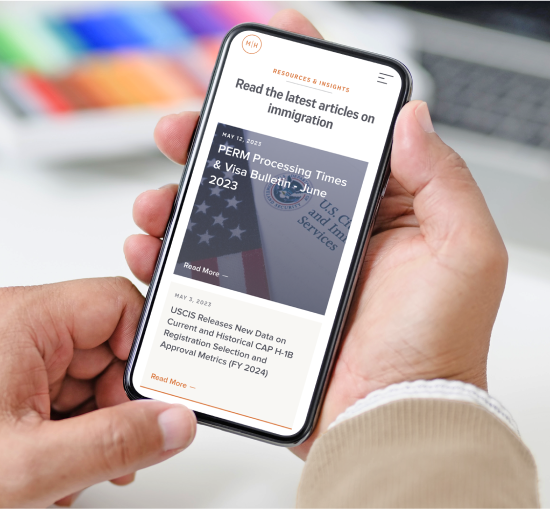
Optimizing to make an impression on the go
As the mobile experience was particularly important for this client, we gave additional focus to how each layout and view translated on smaller screen sizes. In some cases, interactive sections had to be re-thought or streamlined in order to accomplish their desired goal on mobile.
Another consideration was to minimize page-load times and excessive scrolling by limiting the amount of cards or items that are initially visible in certain sections.