Navigation Menu
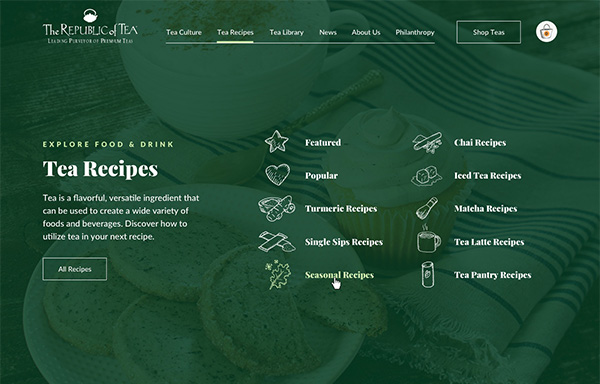
The immersive, full-width navigation sub-menu makes the numerous links easy to digest and provides visual interest in form of custom icons for each topic.

The Republic of Tea provides premium teas, education and innovation to customers across the globe. This socially-conscious company partnered with us to upgrade their blog site in order to educate and engage their clientele as well as generating sales.
Generate ecommerce sales and distinguish the company as the leading premium tea brand online.
Elevate the brand through strategic use of typography and custom illustrations throughout articles and blog pages.
A clean, elegant-yet-modern blog that provides multiple entry points into specialized content and easy access to purchase related products.
In creating an updated visual experience for the blog, we wanted to keep familiar aspects of the company’s branding while incorporating new elements developed for the blog’s specific needs that also felt in tune with The Republic of Tea’s unique culture. One of these additional components was the hand-drawn icon style featured throughout the blog, which was inspired by sketches contained within published letters between the company’s founders.
We combined hues from the brand’s existing color palette with a refined display typeface for a high-class web experience, blending in a bit of organic authenticity in the form of illustrations and icons developed in a hand-rendered style.
We took the informative content already existing in their blog and overhauled the navigation, categorization, and visual presentation in order to deliver an experience that better reflects the company’s brand and market position.



The immersive, full-width navigation sub-menu makes the numerous links easy to digest and provides visual interest in form of custom icons for each topic.
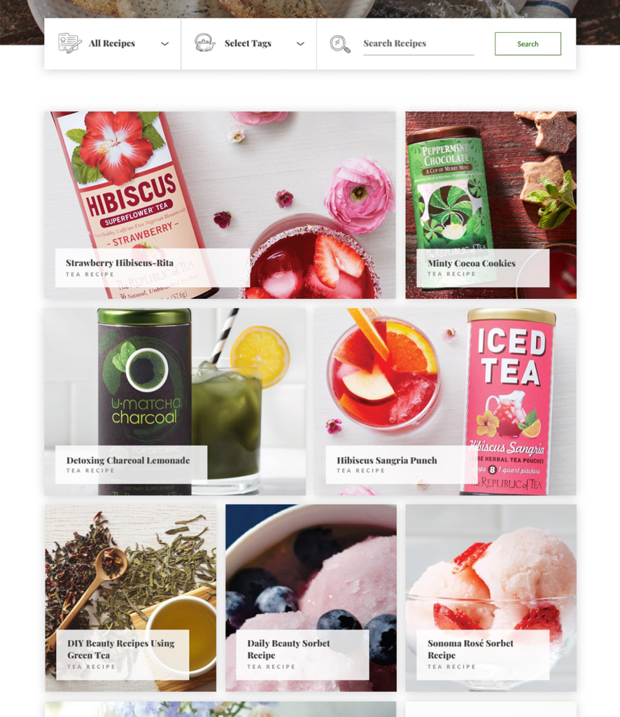
We utilized large, photo-heavy tiles for the blog and recipe posts in order to leverage the beautiful product packaging as a visual element, as well as to prevent the grid from appearing too busy. To make sure users can access the content they are interested in while minimizing scrolling, we devised a set of filters that allows them to easily sort the posts by category or tag, or enter terms into the search bar to the right.
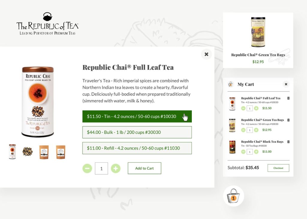
We included links and callouts to products within blog posts and recipes in order to provide opportunities for users to view and purchase, thus using content to drive lead conversion.
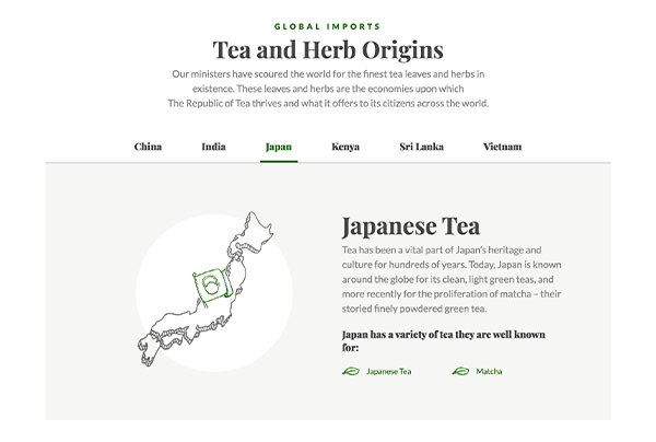
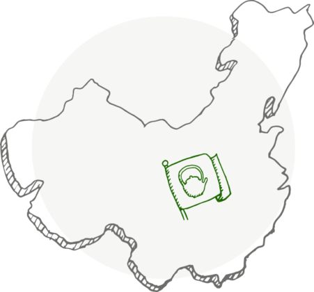
The Republic of Tea’s global mindset is on display as they detail where their products are sourced from. The depth of the information helps underscore their reputation as experts, all while providing valuable education to customers and non-customers alike. Instead of using standard digital maps as visual aids, we applied the brand’s distinctive hand-drawn illustration style to the countries in order to give a customized, brand-appropriate feel to this section.
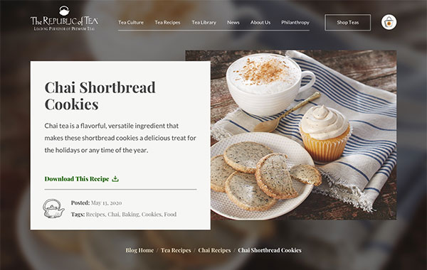
We provided an engaging alternative to plain lists of ingredients by paying special attention to the top section of each recipe, grabbing the user’s interest with colorful photography and prominently displaying a link to a downloadable file for those who already know what they’re looking for.

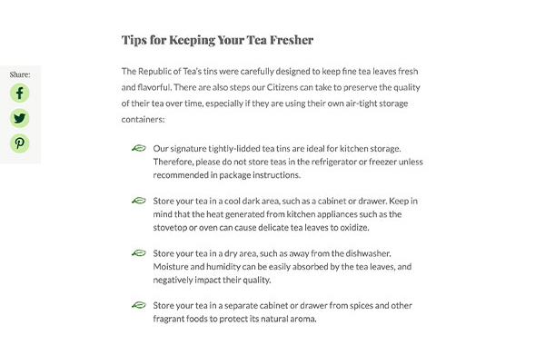
Incorporating personalized details, such as a hand-drawn leaf icon used for bulleted lists, is part of what separates average websites from engaging digital experiences built with the brand in mind.
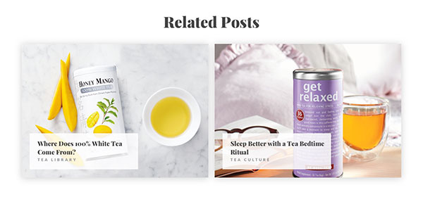
Each blog or recipe features suggested related posts after the article content, which aids the user on their journey to becoming more educated on tea-related topics and helps them find additional value in the site. The design of these card units was chosen to carry through familiar visual styles from elsewhere on the site and develop a harmonious experience from page to page.
The final product is a thoughtfully designed, brand-infused experience that elevates the blog to the lofty heights worthy of a republic, encouraging readers to take a sip and join the tea revolution.
