

Taking credit into your own hands.
TransUnion is a credit reporting agency originally founded in 1968, headquartered in Chicago with over 7,100 employees. With a myriad of customer types and “experiences” for those customer groups throughout the site, our task was to take their UX / UI on conversion-based pages to the next level.
The challenge
Concentrating on high volume pages that needed to be re-worked based on data in order to lead to better conversion rates.
The solution
Provide data-based design wireframes and high fidelity mockups that increased customer engagement and reduced pages per view.
Creating a roadmap to effective communication
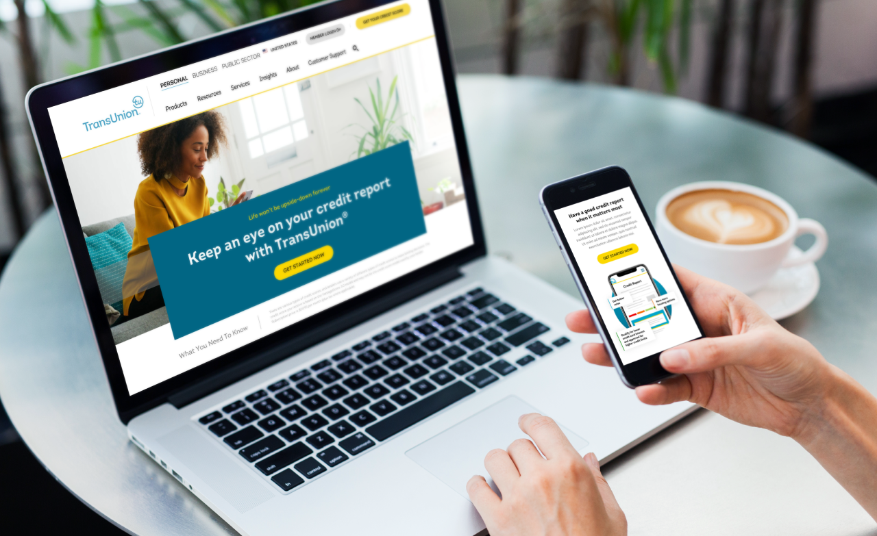
We worked to re-think, re-strategize, and re-design several TransUnion customer experiences with the main goal of driving users towards conversion. We redesign a subset of pages, including the homepage, to tell a better story about how TransUnuin helps its customers.
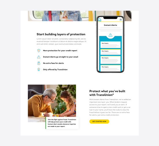
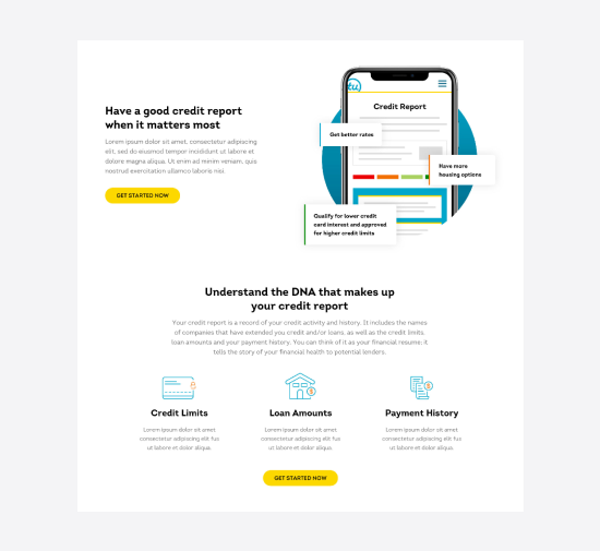
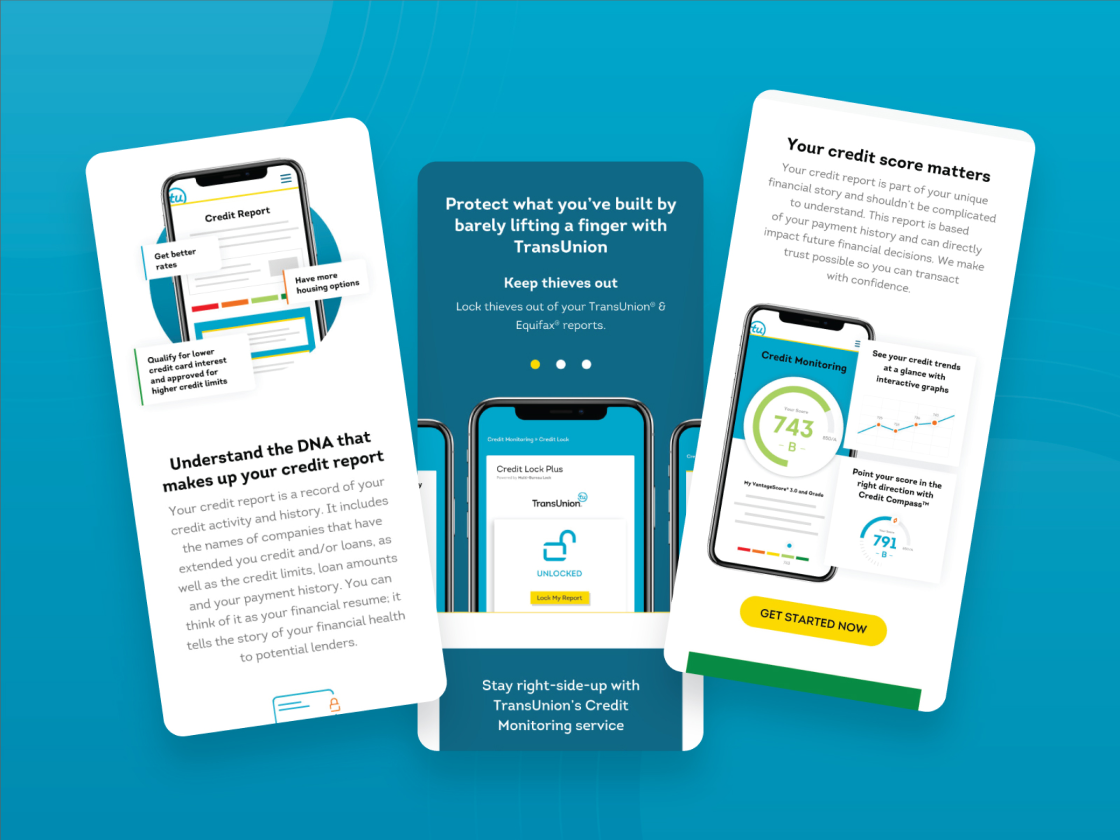
While doing our research we learned that TransUnion customers responded positively to mobile device imagery that showcases the platform, its advantages, and what you can expect by being a TransUnion customer. We know that reading all the fine print behind credit information isn’t exactly the best reading material, so we wanted to make sure we used graphics and iconography to help the call-out important aspects so the customer could easily digest the information.
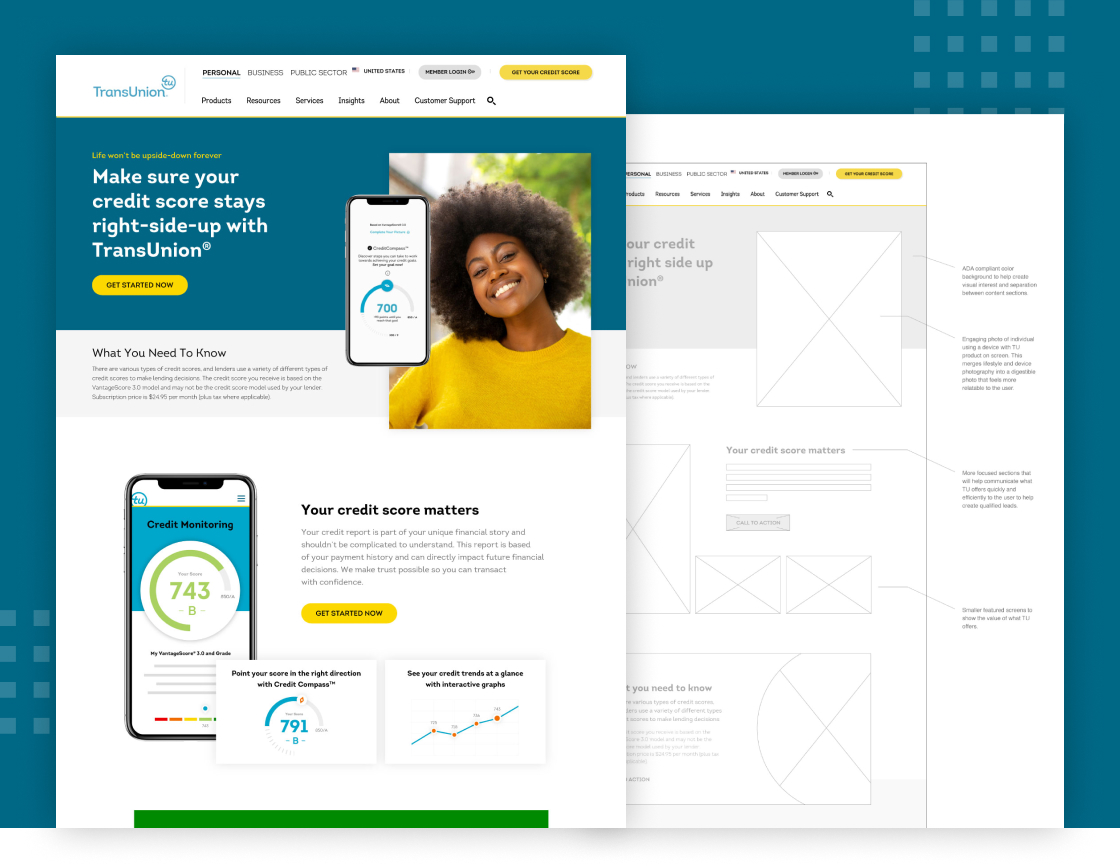
Using real data to develop better design solutions
One of the challenges was to create designs that scaled, allowing TransUnion to test and adjust the layouts that we provided them. With this in the back of our minds, we wanted to make sure that each unique section could work with various amounts of text.
With so much data around mobile visitors, we not only designed for desktop but paid special attention and strategy on how best to improve engagement for mobile visitors. This included custom mobile layouts (not just responsive) that factored Content-driven UX into smaller screen sizes.
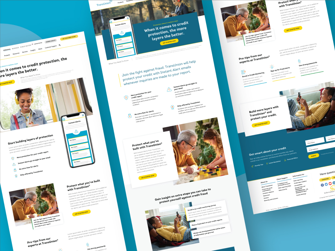
Engaging Visuals
We built custom graphics to help support the information customers were seeking. We leaned into abstract device imagery to show the unique aspects that TransUnion offered over its competitors.
Test Landing Pages
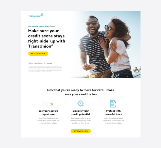
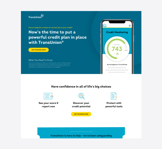
Conversions to help drive qualified leads into the sales funnel was top of mind. As such we worked on creating a series of landing pages based on different marketing campaigns that TransUnion could use to link to specific ad and quarterly campaigns being run.
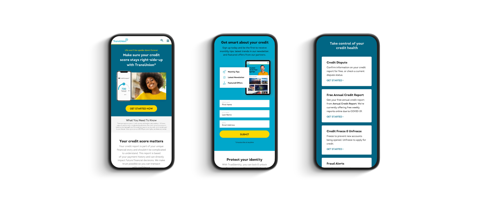
Mobile design were key for their audience
One of the challenges was to create designs that scaled, allowing TransUnion to test and adjust the layouts that we provided them. With this in the back of our minds, we wanted to make sure that each unique section could work with various amounts of text.


Carnegie
Bringing simplicity and elegance to a market leader in sustainable textiles

Freight Science
Building a streamlined customer experience for a SaaS logistics company


City Teaching Alliance
Empowering the educators of tomorrow with a new and exciting UX / UI today